
Apple's grand reveal of iOS 8 at WWDC in San Francisco is still a few days away, but that doesn't mean there isn't any speculation as to what features and enhancements might come packed in the new mobile operating system.
With iOS 7's complete UI overhaul not even a year old, it's safe to say that the design of the new OS won't be messed with too much. Instead, look for little refinements, something Apple is well known for.
As for new features, we can only guess. Multitasking? Heart-rate monitor? Waterproofing? Improved customization? Instead of just talking about it, designer Jay Machalani has taken it a step further by bringing one of his own concepts to real life.
iOS Blocks: App Icons That Are More Than Just Icons
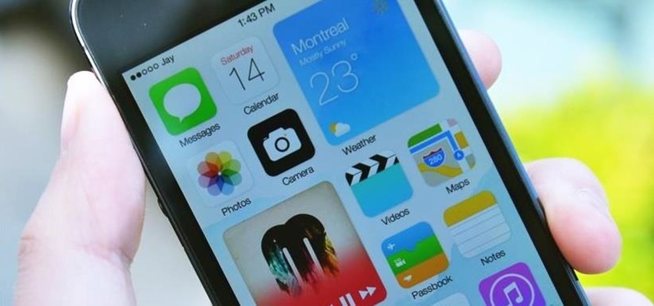
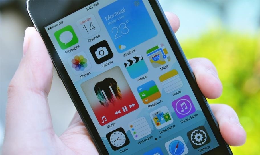
Android has widgets, Windows has Live Tiles, and in Machalani's version of iOS 8, Apple has iOS Blocks, which turn applications on the home screen into large, interactive blocks filled with additional information.
Machalani told WonderHowTo:
"It's not a Widget because it's the app itself and it's not a Live Tile because you can interact with it, and if you don't like it then everything stays the same. I tried to really nail the perfect scenario for a true iOS evolution."
Instead of trying to overhaul iOS 7, Machalani instead refines what already works with the existing operating system, throwing a single large feature into the mix that could benefit many Apple users, including myself.
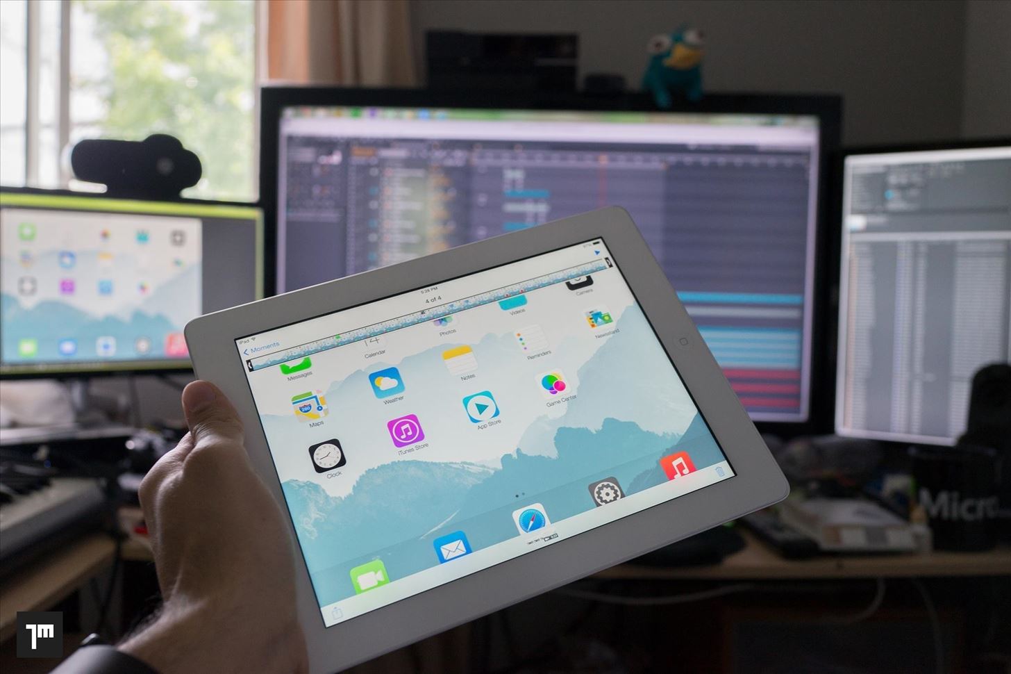
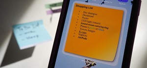
Using the two-finger pinch gesture on an app brings up the iOS Block, showing a few text messages for Messages, playback controls for Music, and the last picture taken for Photos, all which you can see below.
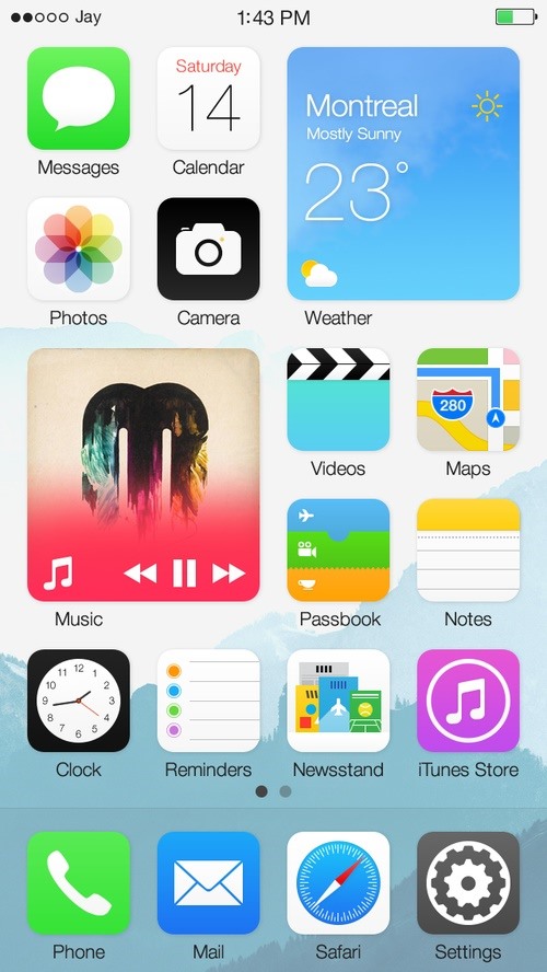
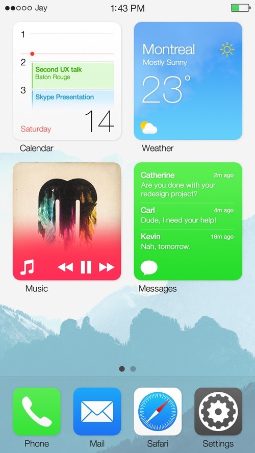
If you pinch back inward, they'll go back to the stock icon. If you leave them as is, they'll stay in the iOS Block form. Directly from the block, you can interact a couple of different ways; swiping left or right shows more app information, while tapping on the bottom left corner takes you into the app itself.
While it's almost impossible to guess what's actually going to be included in iOS 8, something similar to Blocks could be a legitimate feature implemented into the new OS—seeing as the new iPhones are slated to be larger, and the fact that Machalani has a knack for predicting software developments. When asked why he goes through all this work to create these mockups, he told us:
"It's really a hobby, I mean I'm not looking for a job, but side contracts are always fun. I just like solving complicated problems."
So, How Do You Create a UX Mockup Anyway?
We asked Jay about how he created his fantastic mockup videos—not only for his iOS Blocks, but his other conceptual designs—and he was kind enough to share his process. It involves creating a video simulating the UX interaction, then filming yourself pretending to touch the screen while the video plays.
As you might imagine, it all starts with an awesome rig:
The rest takes skill, practice, lots of thought, and patience. Jay's "simple" design process is as follows:
- I use my whiteboard to find the problem, get the variables and set my rules to respect with the objectives.
- I use my Surface Pro 2 on OneNote to sketch some ideas and get a basic structure around those variables before actually designing.
- I use Adobe Fireworks CS6 to get the first mockups and I design the whole thing with layers in Vector format. All from scratch including the existing Apple stuff; it gives you a lot more of control.
- I open up Adobe After Effects CC and get all the layers and designs in a composition the size of the device screen. Place every thing and make sure that if I put the Fireworks file on top there isn't any difference.
- I start the animation process and start to cut deeper each layer so I can manually animate all the elements. On the picture (above), on the right monitor, is just a small peek at all the files that are created in the process.
- Once completed, I structure the animation in a sequence that would make sense for an average user to do.
- I export the animation in a format that can be played on the device. In the case of the iPad it couldn't be a native sized video so it had to be something with an H.264 Level 4.2 tops that does not get higher than 1080p, otherwise the iPad wouldn't play it. A 1440x1080 file worked as the 1080 side stays standard and it's still 70% the size of what the iPad native resolution is. The Retina display and angle of the shot makes sure that we don't see this loss in pixel resolution.
- Lots of practice to get to know the animation and you have to place the camera in a way that you can see on the screen, keep focus, stay natural yet execute at the same rhythm as the video. It's not very comfortable and requires a lot of shots, especially knowing that if I touch the screen… well the iPad video layer would appear and ruin the whole thing.
- You got your video! It really looks like you're resizing icons to Blocks on an actual iOS device and it's easier to sell your idea to the world. Of course, all the research behind your decisions must be there. That's the big difference between a Designer and a UX Architect.
If you'd like to learn more about the UX thought process behind the design, you should read through Machalani's very detailed blog post on the matter.
So what do you think about this look and Jay's design process? Would you want to see it on iOS 8? What features do you want to see on iOS, and have you ever thought of building your own design concepts? Let's just hope Apple tweaks some of the issues with security, wallpapers, and everything else that went wrong with iOS 7's launch.
Stay tuned, we'll know the answer to these questions on Monday when we start our coverage of WWDC.
Just updated your iPhone? You'll find new emoji, enhanced security, podcast transcripts, Apple Cash virtual numbers, and other useful features. There are even new additions hidden within Safari. Find out what's new and changed on your iPhone with the iOS 17.4 update.


2 Comments
It's a really cool concept, I like it.
While I'm not a heavy Apple user, I do love the simplistic design of iOS 7. It's clean, simple, and just pleasant to look at; I really do think people overlook that ideal of less is more.
Thanks for the article.
ghost_
Great idea Jay... love your thoughts and hope for an development with apple. It's a perfect customization for the great iOS System!
Share Your Thoughts